
The owner at the counter
Runs a small shop, often alone.
- Sell fast, with a customer waiting
- Know what’s running low


Stock and sales for small businesses, from the POS terminal to the phone, the laptop and Konga’s own team
KongaPay merchants took payments on a POS terminal, but their stock lived in notebooks and spreadsheets. I designed Inventory from 0 to 1: the product thinking, the user flows and the screens for the POS terminal, the merchant app, the merchant web and an admin console for KongaPay’s team.


Product thinking, user flows, UX and UI
TimelineAbout 2 monthsof design, from brief to handoff
and finance, compliance, marketing and developers
on an accelerated schedule, using the KongaPay design system
POS terminal, merchant app for iOS and Android, merchant web
for KongaPay’s own team
“We want to add inventory management to the POS features.”
The whole brief, from KongaPay’s VP of Technology on a Thursday evening
KongaPay wanted Inventory to serve SMEs and MSMEs: the merchants already taking payments on its terminals, and the small businesses it wanted to win next. The business wanted to be first to market, ship quickly and learn from live merchants, and an external agency was lined up to build it on an accelerated schedule.
There was no requirements document and no research budget. The audience was also much wider than the merchants KongaPay already knew. So before defining the experience, I needed a clear picture of who these businesses were and how they actually sold.
Serving SMEs and MSMEs meant designing for businesses KongaPay hadn’t met yet. Without time or budget for interviews, I built the picture from published data and from the people around the review table. Three findings shaped the first flow.
What it meant: design for the one-person shop. No inventory manager, no laptop, no clean product catalogue. The first screen has to make sense on its own.
What it meant: phone first, with most fields optional. For most merchants this would be their first inventory software, on a small screen.
What it meant: on the terminal, scanning, search and Start New Sale go up front.
The MSME count is the National Bureau of Statistics figure of 39,654,385 for 2020, as cited in the PwC MSME Survey 2024. Tool use comes from the same PwC survey of Nigerian MSMEs.
The brief named one device, but the research pointed to three kinds of people, each in a different place when they deal with stock. That decided which surface does which job.
Runs a small shop, often alone.

An accountant, or a merchant with hundreds of items.

Operations, finance, compliance and marketing.
Without interviews, every feature rested on a belief about merchants. I wrote each one down with the design response and the signal that would show whether it was right after launch.

Design: a first screen that explains the tool in 4 short lines, with one button to add the first item.
What would show it worked: new merchants add an item on day one.

Design: CSV upload with a template, a preview, and errors named by row.
What would show it worked: most first stock arrives by CSV, with few failed rows.

Design: selling inside inventory, so scan, basket, pay and receipt all move the count.
What would show it worked: most terminal sales carry items, not just an amount.

Design: an editable unit price that keeps the old price on record.
What would show it worked: price edits are common, and margins in reports match reality.
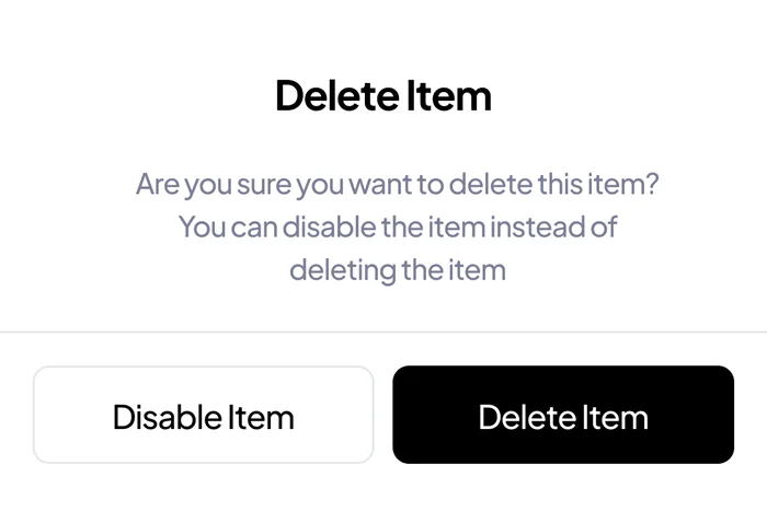
Design: Disable offered first whenever someone tries to delete.
What would show it worked: disables outnumber deletes.
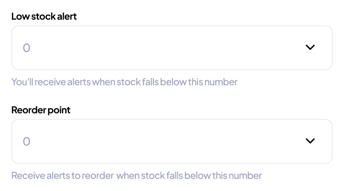
Design: alert and reorder levels the merchant sets, plus nudges from KongaPay’s team.
What would show it worked: restocks follow alerts.
If we were going to learn from live merchants, every decision had to state the belief behind it, so we’d know exactly what to measure after launch. That’s where the six bets came from.
Every screen uses the existing KongaPay design system: its type, colour, buttons, forms and sheets. The agency could build fast, and a new pattern had to earn its place.
Anything we weren’t sure about, like branches and product variations, went in as an optional field rather than a new screen. Easy to grow if merchants use it, easy to remove if they don’t.
The brief said POS. But a merchant also checks stock on her phone, her accountant uploads sheets on a laptop, and KongaPay’s team watches the whole network. I mapped the first user flow with a few rough wireframes and got all internal stakeholders in the room so the big questions came up before anything was polished.
Each surface got the jobs that fit where it’s used, and all of them read from and write to one inventory record.
Because every surface works from the same record, a change in one place shows up everywhere else without anyone re-entering it.


one inventory record. Added on the phone. adds stock. Sold at the till. deducts on sale. Checked on the web. logs every change. Seen by KongaPay. flags low stock
Sharing the flow early made room for questions in review. Each of these changed the product, not just a screen, and each one leads to the chapter it shaped.
“Is delete the same as disable?”
It was, in my first flow. Now an item can leave the shelf and keep its history.
The merchant app“I didn’t see the checkout flow for the POS.”
Selling moved inside inventory, on the terminal where the sale happens.
The POS terminal“Will merchants get a web version”
Inventory got its own web workspace for bulk work.
The merchant web“Does POS checkout accommodate haggling?”
Now when the customer asks for a discount, the cashier edits the unit price.
The POS terminal“How do we handle variants”
Now, merchants can enter stock variations. One product in different sizes or colours
The merchant app“How is tax added on inventory stock?”
Inventory upload got its tax and tax rate entry point.
The merchant webGetting stock in
An inventory tool is empty on day one, and an empty tool is easy to abandon. Since our assumption was that our target merchants had never used inventory software, and many already kept stock in a spreadsheet or a notebook. If adding stock felt like work, nothing else in the product would get used.


Stock arrives as a box with a supplier receipt, as one-off items, or as a spreadsheet kept for years. So Add New Inventory opens three options: scan a receipt, add manually, or upload a CSV.
Every route ends the same way. Before anything saves, the merchant sees a summary of what she is adding.


Products sold in different sizes or colours go in as variations of one item, so the merchant isn’t creating the same product five times.
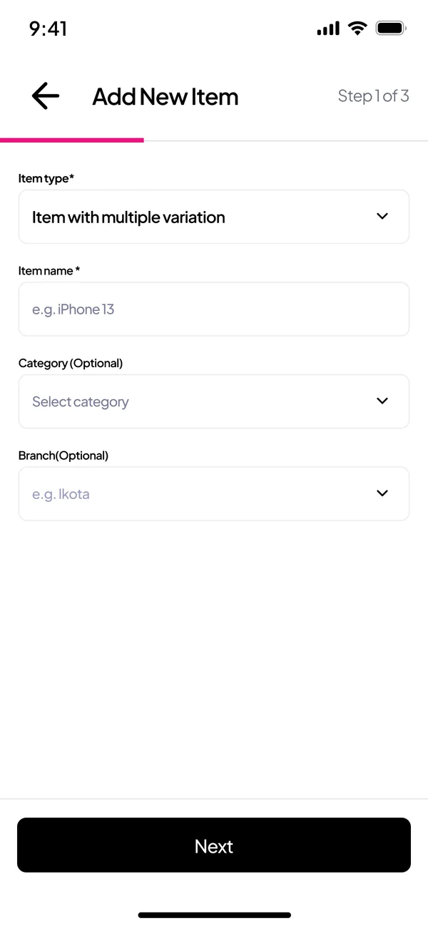


A merchant uploading her old stock list is trusting us with years of work, and a sheet kept by hand will have mistakes in it. Errors are named by row, with what to fix, so one bad row never sinks the whole upload.


“Is delete the same as disable?”
In my first flow it was. The question made me look at what deleting really does. If a merchant deletes an item she has sold, last month’s receipts and finance’s reports lose their story.
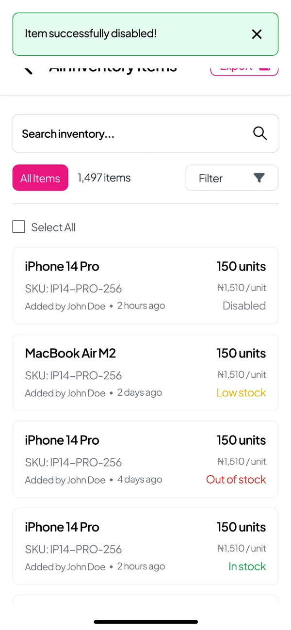
So I split the two. Disable takes an item off the shelf, keeps its history, and can be turned back on. Delete still exists, but its confirmation offers Disable first.


Selling at the till
“I didn’t see the checkout flow for the POS.”
I had scoped inventory as stockkeeping: add items, track them, and get alerts. But stakeholders wanted it as a till. If the sale happens somewhere else, the count drifts and merchants stop trusting it. So selling moved inside inventory on the terminal where the sale happens.
That changed the terminal’s home screen. Earlier wireframes led with a list of stock. The version we handed off works like a till: search or scan at the top, the day’s sales, stock cards, and one list of recent activity where a sale and the low stock alert it causes sit together.
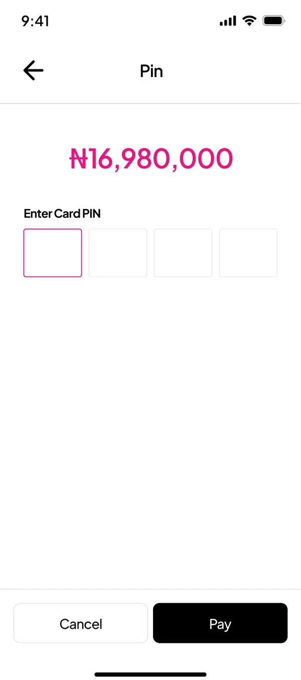
Here’s the scenario I designed for. A customer wants one iPhone and four MacBooks, then asks for a discount. Every line shows its stock status, the cashier can change a price, and the old price stays on record.


A workspace built for bulk work
“Will merchants get a web version?”
Our assumption was that merchants with hundreds of items and accountants who keep their books, do the heavy work on a laptop. Inventory got its own web workspace inside the existing merchant dashboard.
Tables replace cards. Adding stock happens in a drawer, so the page stays in view, and the steps, fields and helper text match the app, so nobody learns the tool twice.


What it is. The drawer slides in over the page you were on. Single item, or one with variations.
On a laptop the merchant can see every column of her sheet at once. Errors are still named by row, and if she chooses to go ahead, only the valid rows go in.


The dashboard leads with value, then the trend, the mix of stock and the alerts. History, sales, reports and users each get a full table.


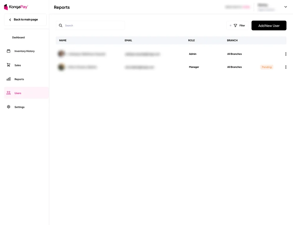
A merchant with staff can bring her team in. Each person gets a role and for merchants with multiple locations, a branch.


Watching the network
Finance, compliance and marketing each asked what KongaPay would see. The console shows the network: who is about to run out, which terminals have gone quiet, and who changed what.
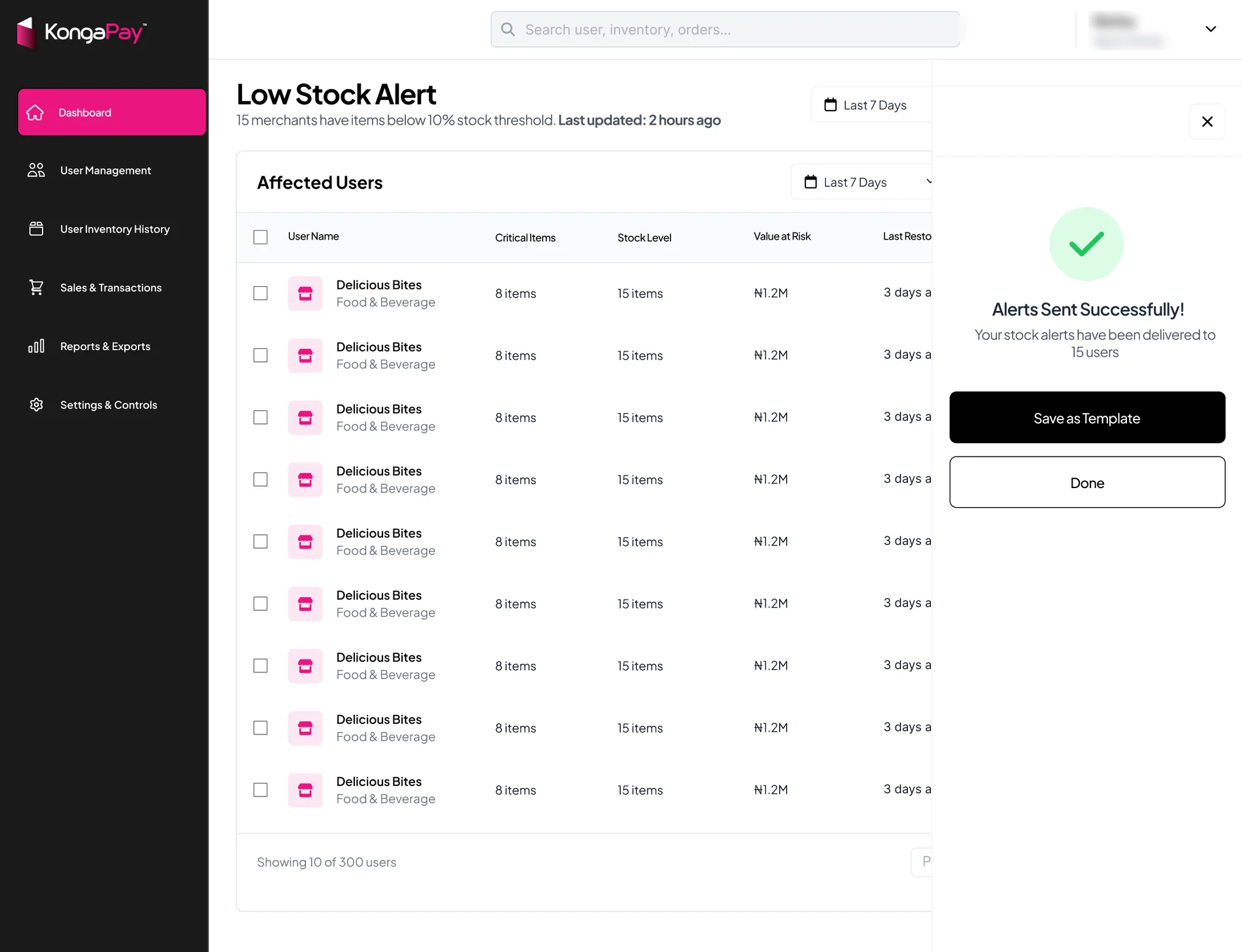
A low stock warning only helps if someone acts on it. Ops can see every merchant below their alert level, with the value at risk, and send them a nudge in three steps.


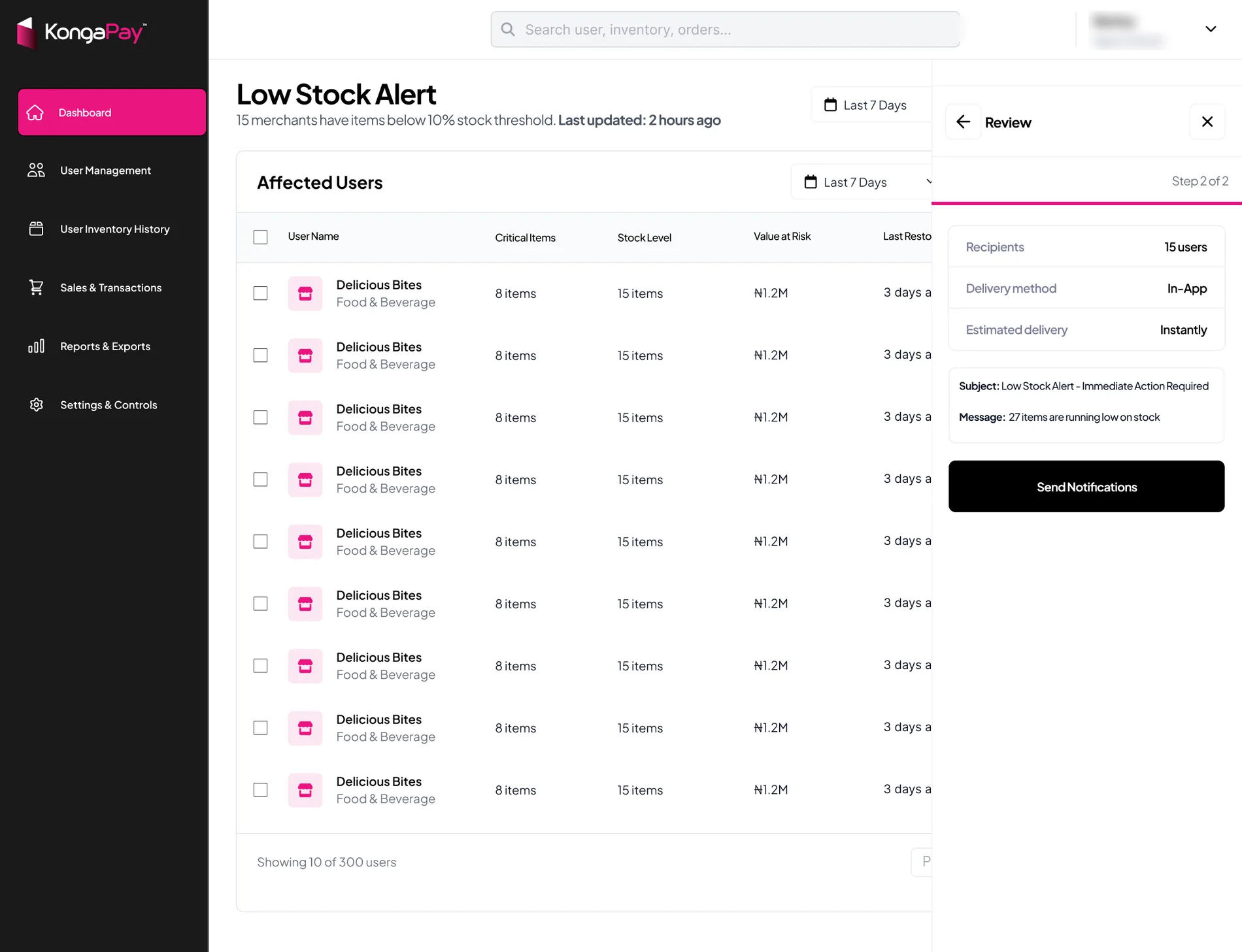
Overview. Active merchants, sales, inventory value and pending verifications, then the sales trend and top performers.
Every merchant with their status and activity, and every terminal with whether it’s online, in one place for the team that supports them.


An external agency built Inventory, and KongaPay wanted to be first to market, so the schedule was tight from the start. That shaped how I worked as much as what I designed: every decision had to be clear enough for the agency to build from fast.
Several rounds of testing the staging build ensured that the implementation actually matched the defined user experience.
About 8 weeks of design, from brief to handoff
I kept the system’s type, magenta, black primary buttons, forms and sheets, and added a few inventory pieces that behave the same on all four surfaces.
Each card is tappable and leads to the items behind the number, on every surface.
Colour and words together, so nobody has to remember what yellow means. Disabled is grey on purpose, because it isn’t a warning.
Sales and stock changes share one row, so a sale and the alert it triggers sit side by side.
Three steps, always visible, on the phone and in the web drawer. Helper text says what each number will do.
Are you sure you want to delete this item? You can disable this item instead of deleting the item
Any action that loses history offers the reversible option first.
The agency built from the files, and Inventory went live for KongaPay merchants. A one-line brief about the POS became one inventory record behind four surfaces: selling on the terminal, adding and managing stock on the phone, bulk work on the web, and a view of the whole network for KongaPay’s team.
There’s no post-launch usage data for me to share. The research shaped who we designed for, and the six bets say what should be measured. If I had stayed at Konga longer after launch, I would have:
The best reviews were questions. Sharing a rough flow early is what made room for meaningful questions.
Without interviews, the bets were the research I could act on. Writing each one with its signal turned guesses into things the team could check after launch.
Open to design roles. I’m in Lagos, and my hours match the UK and Europe, with a few hours of overlap with the US.
