A yearly subscription in US dollars, for a business earning in naira


Konga Search Service
Bringing the tool behind every shopper search in-house
The search box Konga shoppers use runs on this tool, and so do the rules that decide what it shows.
I was the lead designer on Konga’s in-house search and merchandising platform. It replaced a third-party search tool paid for in US dollars, and brought search rules and product recommendations, which had run on separate services, into one interface. Because it followed a standard search-management layout, merchandisers moved across at launch without retraining.


Why the old tool had to go
Cost
Konga earns in naira but paid over $75,000 a year, in dollars, for a third-party search tool. It was also an outdated version, so the dollar price bought less than the current product offered.
Integrations
The integrations engineering wanted sat in a pricing tier Konga wasn’t paying for. Product recommendations ran on a separate service, and voice and image search had nowhere to go.
Daily use
Shoppers searching for a phone got accessories first, and staff testing the site saw the same. The outdated interface was hard for merchandisers to work in, so fixing results was slow.
Before and after
The third-party tool
Cost
Daily use
An outdated interface that was hard to work in
Integrations
The integrations engineering needed were in a tier Konga didn’t pay for
What’s next
Recommendations on a separate service, and no place for voice or image search
Konga Search Service
Cost
No vendor subscription for search, and over $75,000 a year avoided
Daily use
A layout merchandisers already knew, with no retraining at launch
Integrations
Konga’s own platform, so integrations are an engineering decision, not a pricing one
What’s next
Search and Recommend in one workspace, with voice and image search ready to switch on
Released, and received well
The engineering manager who led the build announced the release of Konga Search and credited the group who built it. I was part of that group.
“We were spending over $75,000 a year on a third-party search tool, but our customers still struggled to find what they needed.”
$75K+A year in third-party search costs avoided
It was the work of a team.
The trade-off: building in-house meant a period where relevance was still maturing. Putting the merchandising controls first meant the team could close that gap itself instead of waiting on engineering for every change.
A familiar layout, on purpose
I didn’t design a new kind of tool. Merchandisers already knew how search-management dashboards are laid out, so I followed that standard layout and spent the design effort where no layout could help. That meant no retraining at launch, and engineering could build against a pattern everyone already understood.

One workspace for search and recommendations
Search rules and product recommendations used to live in separate tools. I mapped how they could share one product rail, one set of components and one way of writing rules. Recommend has its own models (complementary, alternative, trending, looking similar) and its own rules, written the same way as search rules.
Voice and image search weren’t part of the first release, but I gave them a place in the rail and in index settings, switched off, so engineering had a home for them when the time came. Personalization got the same treatment.

A component library for the build
I broke the interface into reusable parts, so engineering could build a piece once and use it everywhere. The library also gave design and engineering the same names for things, which mattered when we talked through complicated search logic.



The cases a layout doesn’t show
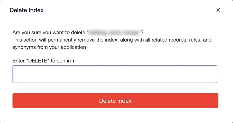
Following a familiar layout settles where things go. It doesn’t say what happens when there’s nothing there yet, when an action can’t be undone, or when 2 rules pull in different directions. I worked those out with search engineering, one case at a time.



Reviewed case by case, tested with merchandisers
Design reviews went through the search logic case by case: how rules combine, what a pin does under a filter, what shoppers see when nothing matches, and which actions need a confirmation step.
In testing, I sat with merchandisers while they worked through their usual tasks, to check the new tool was easier to use than the one it replaced. At launch they moved across without retraining.
From a rule to a search result
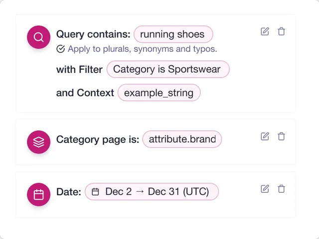
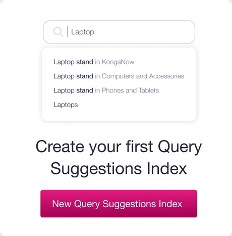
Merchandisers write rules here. Each one has a condition, such as what the query contains, and a consequence, such as pinning a product to a position. Those rules decide what shoppers see in the search dropdown and the results behind it.

The rule and the dropdown are shown side by side to explain the relationship. They aren’t the same search.
What I took from it
When a business is paying $75,000 a year for a tool that isn’t working, the useful design is the one people can use on day one. Following a known layout freed time for the parts no layout covers.
Designing the parts with engineering, rather than handing over screens, kept a year-long build moving and gave us a shared way to talk through complicated search logic.
Shoppers got better results because merchandisers could finally fix them. Work behind the scenes showed up on the storefront.

Open to design roles. I’m in Lagos, and my hours match the UK and Europe, with a few hours of overlap with the US.